Documentation for JIRA 4.0. Documentation for other versions of JIRA is available too. ![]()
![]()
課題ナビゲーターの検索結果は、様々なグラフ形式で表示できます。以下に説明するように、グラフガジェットとしてダッシュボードに保存することも可能です。
グラフは、様々な方法でフィルターの視覚的な表示を提供します。一般的に、グラフには以下の特徴があります。
- 現在の日付以前の X 日間の期間を示します。
- 時間、日、週、月、四半期、または年という漸増期間に分類されます。
- 課題ナビゲーター内の関連課題へのハイパーリンクが設定されています。
On this page:
グラフの外観
たとえば、「作成済み vs 解決済み課題」グラフは、次のような外観です。
スクリーンショット:「作成済み課題 vs 解決済み課題」グラフ

これは、利用可能なグラフガジェットの1つにすぎません。用意されているグラフの一部を以下に挙げます。
- 'Created vs Resolved Issues' — a difference chart showing the issues created vs resolved over a given period.
- このグラフは累積または非累積のいずれかで表示できます。
- 赤色の領域は、解決された課題よりも作成された課題のほうが多い期間を示しています。 緑色の領域は、作成された課題よりも解決された課題のほうが多い期間を示しています。
- バージョンもこのグラフに追加でき、課題の作成と解決がどのようにバージョンのリリースと関係しているかを示します。
- 'Resolution Time' — a bar chart showing the average resolution time (in days) of resolved issues.
- これは、タイムリーな課題の解決に関して、チームが向上または低下しているかどうかを経時的に示すのに役立ちます。
- 'Pie Chart' — displays issues grouped by a statistic type in pie-chart format
- 課題は、あらゆる統計タイプ (ステータス、優先度など) 別に分類可能です。
- 'Average-Age Open Issues' — a bar chart showing the average number of days that issues have been unresolved
- このグラフは、課題が未解決のままになっている期間の平均を特定の間隔 (日単位、週単位など) で表示します。
- 'Recently Created Issues' — a bar chart showing the issues recently created.
- 棒グラフの緑色の部分は、作成された課題のうちの解決済み課題を示し、赤色の部分は未解決の課題を示します。
- これは、どのくらいのペースで課題が作成されており、そのうちいくつの課題が解決されたかを視覚的に示します。
- 「課題の経過時間」 — 特定の日付に設定された、選択した日付フィールド (「作成日」「更新日」「期限」、「解決日」、または日付カスタムフィールドなど) の課題の数を示す棒グラフを表示します。
- 「ステータスでの平均時間」* — 課題があるステータスの状態にあった平均日数を表示します。
- 'Average Number of Times in Status'* — displays the average number of times an issues has been in a status.
- 「初回応答時間」* — 課題があるステータスになった平均回数を表示します。
*This particular chart will only be available if your JIRA administrator has installed the Charting plugin.
グラフを表示する
To view your search results as a chart,
- On the top navigation bar, click on the 'Issues' tab.
- Refine your search, as described in 'Searching for Issues', until the required results are displayed in the Issue Navigator.
- Click the 'Views' menu, and select 'Charts'.
- Your search results will be displayed as the default chart. If you wish to select a different type of chart,
- Select the desired 'Chart Type', as listed in the previous section.
- If you wish to edit the chart parameters click the cog icon
 and click 'Edit' from the dropdown menu that displays. The configuration form for the chart will display. For example, the 'Created vs Resolved Issues' chart requires the following information (click to view larger image):

- Update the chart settings as desired.
- Click 'Save'.
Adding Gadgets to your Dashboard
To create a chart based on your search results and display it on your dashboard (note that this process will also create a saved filter):
- View the desired search results in your Issue Navigator.
- Click the 'Views' menu, and select 'Charts'.
- Your search results will be displayed as the default chart. If you wish to select a different type of chart, you can change the chart and chart settings as described in Viewing a Chart above.
- Click the 'Save to Dashboard' button. The 'Save chart to a Dashboard' screen will display as shown below (click to view larger image).
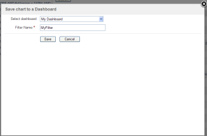
- Select the dashboard to display the chart on in the 'Select dashboard:' field and type a name for your search results in the 'Filter Name' field, then click the 'Save' button. The chart will now appear as a gadget on your dashboard.
- If you wish, the gadget can be repositioned on the dashboard through the dashboard configuration page.
すべての JIRA ダッシュボードガジェットに関する詳細は、ダッシュボードガジェットを使用するドキュメントを参照してください。
Internet Explorer のキャッシュ構成について
Internet Explorer をご利用の場合、チャートを適切に出力できるようブラウザを構成する必要があります。
- Select 'Internet Options' from the 'Tools' menu:

- The 'Internet Options' window will display. Click the 'Settings' button in the 'Temporary Internet files' (i.e. cache) section:

- The 'Settings' window will display. Ensure that you have do not have the 'Every visit to the page' (i.e. no caching) option selected. If so, select the 'Automatically' option instead.

概要
コンテンツ ツール
アプリ


 Except where otherwise noted, content in this space is licensed under a Creative Commons Attribution 2.5 Australia License.